So, here’s a question for you. What do coronavirus, petrol stations and the ‘pingdemic’ have in common? The answer is actuarial analysis! I am using my skills at the very centre of government, providing timely analysis so that the most informed decisions are taken in a crisis.
I have been seconded from GAD to the National Situation Centre (or SitCen). I use actuarial skills to provide data and analysis on national crisis issues. I joined SitCen in March 2021 and it went live about 6 months later.

Data and expertise
Sitcen is located in the Civil Contingencies Secretariat which is part of the Cabinet Office. It was created to gather and collate reliable and timely data about all aspects of crisis response following the COVID-19 pandemic. Through the response to COVID-19, it became apparent that good data was critical to make the best decisions.
The SitCen team needed help with analysis, modelling and quality assurance. GAD was the natural place to look for that, having helped in those areas during the pandemic.
I was seconded to SitCen with other GAD colleagues who have rotated in and out. Over time there will be a pool of people from GAD who are able to contribute to SitCen in a crisis.
Actuarial skills
My role is twofold: to model past data to make projections (one of the main skills of actuaries) and to lead on economic analysis. Information flows in from across government and public sector agencies to create dashboard visualisations and briefings for senior officials and ministers.
The team works on risks listed on the National Security Risk Assessment which covers everything from flooding, and infectious disease to cyber-attacks.
It’s the organisation’s job to think ahead and work out what insights would be needed if any of these risks came to fruition.
Mentioned in despatches
In October 2021, the Cabinet Secretary Simon Case referred to our work here in SitCen. Talking about how the government has upped the ante when it comes to data, he said various teams including ours bring “…better evidence into policy and delivery discussions at the heart of government.
“Departments are the real catalysts of change through their use of data in designing and delivering better public services.”
Petrol, what petrol?
During the fuel crisis last September, I was on the team which looked at the real-time data on how much petrol the stations had left.
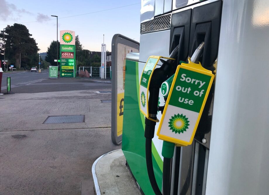
For 3 or 4 weeks before the crisis, when the economy was opening up and road traffic volumes were up, the data indicated the level of fuel in petrol stations was steadily going down.
Suddenly in late September there was a spike in demand driven by media stories of panic buying and many petrol stations ran out of fuel.
We worked with BEIS to acquire hourly data on sales, deliveries and stock levels. As SitCen has its own briefing room we were able to show senior officials how numbers were changing and help them understand when the situation was likely to improve.
Pingdemic
I also worked on the data around the pingdemic. In July 2021 various parts of the economy, including restaurants, reopened.
The NHS test and trace app was in widespread use and as a result there was a rapid increase in the number of pings. This led to a so-called ‘pingdemic’ and it coincided with the country opening again.
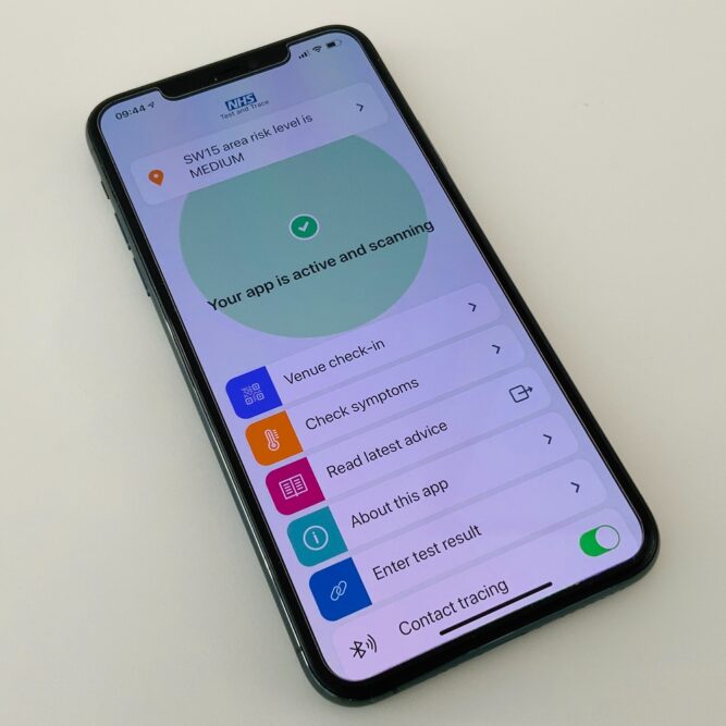
We analysed the number of restaurant bookings and how they correlated with the number of pings and contract tracing numbers.
The data showed a divergence between the rapid rise in pings (up to 6 per person) compared with contact traces (2 per person). This indicated that pings were running above likely infections.
This had happened before when there were openings and the policy decision was made in August to say if you are vaccinated and pinged, you need no longer isolate.
Time sensitive

In a nutshell, I’ve been looking at data to see if we can use it to provide insight on fast moving crises.
It has been very challenging to provide analysis on the recent Russia/Ukraine crisis, but very fulfilling to know our insight has been valued by senior decision makers in the Cabinet Office and Number 10.
Disclaimer
The opinions in this blog post are not intended to provide specific advice. For our full disclaimer, please see the About this blog page.
Recent Comments